Tutorials are such a hugely important part of games that are often delegated as much effort and attention as an afterthought—perhaps unsurprisingly so, given that tutorials may be created only after the core mechanics and visuals are done, lest there is nothing to instruct the player on.
However, for a game to not lose its players early on or overwhelm its players in general, it not only needs “tutorials” that show, don’t tell, but also carefully crafted guidance through both design and presentation, using icons and imagery over text.
Kirby: Star Allies (Switch), courtesy of Shirrako.
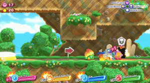
Let’s get away from the abstract lecturing and move onto an example. Starting from the top-left, we have Kirby’s lives and stars, a standard set by platformers throughout the ages. Collecting 100 stars results in an additional life, and since the two are related, they’re next to each other, but they aren’t particularly important moment-by-moment. In fact, if the camera is usually focused around Kirby such that he’s in the center to lower half of the screen, and the player is often moving from left to right (especially in the early game when players are still getting used to things), then in a game like this, the top left corner could be considered a good place to put information we don’t need to look at often, while important information can be put in spaces where it’s easier to glance at—a bit less far from where the player is looking, yet unlikely to interfere with the level.
We can see that the 4 characters’ info at the bottom are just that—present, but not obstructive. The only pieces of text to be read are the name of the character and whether they are player or computer controlled, which are both relatively easy to process, and in time, largely ignorable. (The “exception” with the names is Kirby, whose displayed name is his ability, perhaps because identifying his ability’s name is slightly more informative than just putting “Kirby”.)
The ability for support characters to affect Kirby—such as turning his sword into a fire sword—is shown through simple but effective imagery, and only when it’s actually relevant. By contrast, some games dump information on the player at inopportune times, which can result in players forgetting said info or not recognizing the situations where it’s relevant.
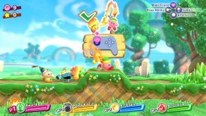
Then we have the main controls at the top-right. Note that the buttons don’t even show the letters on the actual Nintendo controller, but rather icons symbolizing the actions, and which button they correspond to on the controller can be inferred by their relative positions. (That is to say, the button on the right is jump, the button on the bottom is attack, etc.)
Players understand this idea of “relative position” intuitively, just as they understand the animated icon of the control stick being moved from a neutral position to an upwards position (see the GIF above again) to indicate that the door in the foreground can be entered by pressing upwards on the left control stick.
“What if they think they need to move the right control stick?”
I think this is fairly unlikely in part because the player already knows how to move left and right throughout the level, so using the same part of the controller to move inwards (upwards) just makes sense—it’s not even something most people would question.
Beyond this, there’s also the camera zooming in slightly around Kirby and the door, which could signify that an action is to be taken within the focused area of the camera, a very subtle hint that can help subconsciously guide the player. Such hints may seem pointless to some, but when designing a game for kids or inexperienced gamers, these hints can serve as little tools that allow someone to pick up a game and make educated guesses as to both what things are important in the game and how to interact with them.
While there’s a lot more I could say on this, such as the impact of visual effects, audio cues, and more, I don’t want to overwhelm you like poor tutorials can overwhelm players, so let me go ahead and list what I hope one might take away from this for now:
– Try to use symbols, icons, and imagery to compress information and minimize text
– Try to prevent the active UI (what is constantly present in the game) from distracting from what’s important
– Keep the game looking simple at the surface, at least relative to its overall gameplay depth
You can always add more detailed information through menus, during loading screens when the player isn’t occupied actually playing the game (as per the screenshot above), or just on an as-needed basis!